






SleekPixel for early access cards
SleekPixel reads the program name, cohort size, eligibility line, and apply-by date from a single early-access post and renders a Twitter-card invitation. The same image powers social, email, and in-app banners without anyone re-cropping for each surface.
♾️ Lifetime License available
Early access is a separate stage from beta - the card should reflect that
Early-access programs sit between closed beta and general availability. The cohort is larger, the product is more stable, and the messaging needs to feel less experimental. Most teams reuse beta-invite copy and graphics for early access, which undersells the readiness of the product. A dedicated card that names the cohort size and the eligibility clearly signals the right stage.
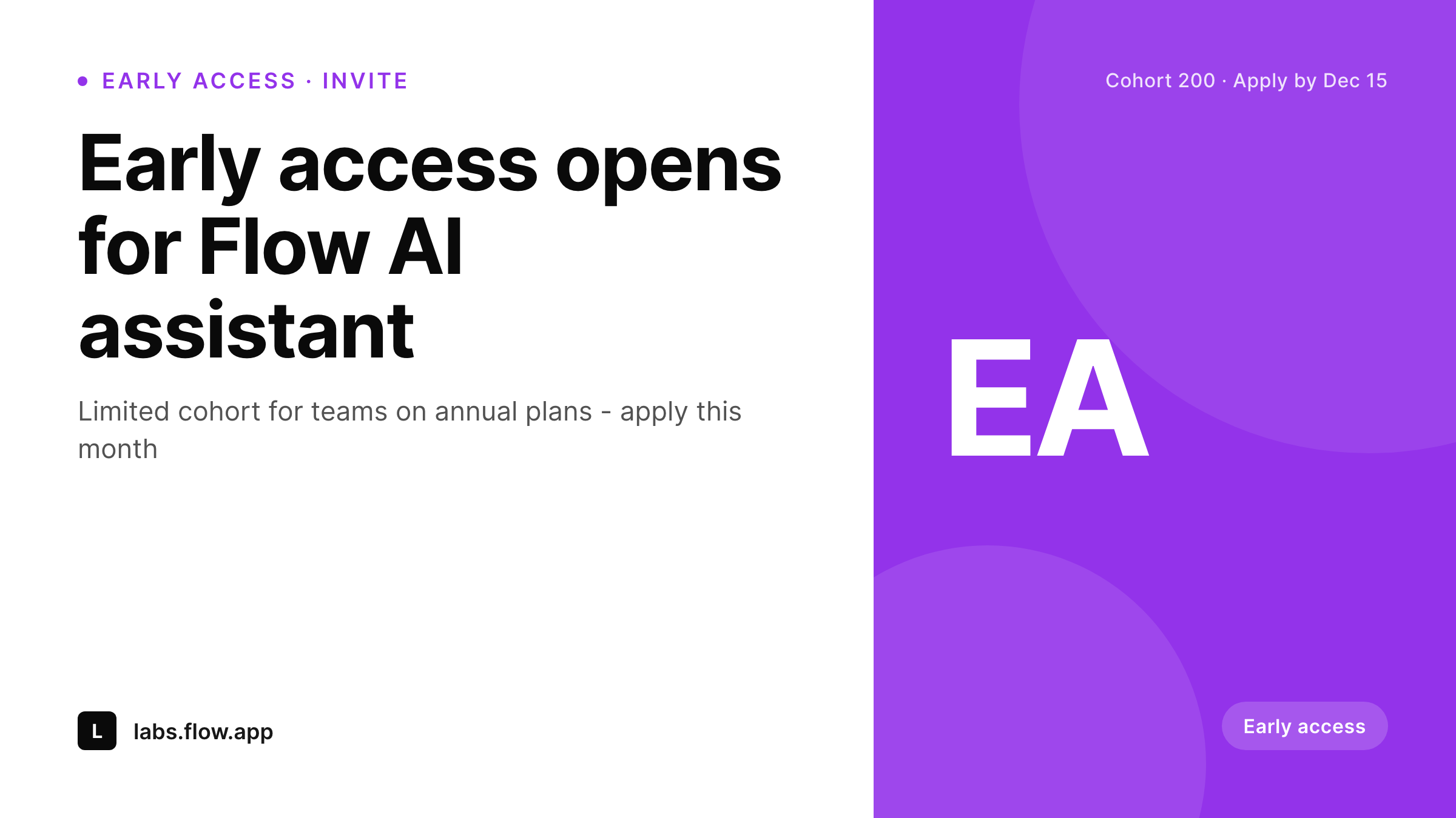
SleekPixel reads the early-access post's program_name, cohort_size, eligibility, and apply_by fields, then renders a 1200x675 Twitter card. The visual style sits between beta (experimental) and GA (polished), which is exactly where the program lives. The full program detail and application form stay in the post body.
When the apply-by date approaches, edit the post to update the urgency line. When the cohort is selected and onboarded, switch the post status to 'closed' and SleekPixel renders the closed-state variant. One workflow, multiple stages, all visible to customers.
Workflow
How a card renders, end to end
Create the EA post
early-access CPT post. Fields: program name, cohort size, eligibility, apply-by date, application form URL, program narrative.
Bind the template
Save
Stage the lifecycle
Output
Sample early-access card
Rendered from one early-access post: program name, cohort size, eligibility line, and apply-by date. The application form lives in the post body.
Comparison
Default twitter card vs SleekPixel for early access cards
Beta announcement reused for EA
- Early access programs use beta copy and graphics by default
- Cohort sizes in the post and the share image drift after invitations
- Apply-by dates fall behind when calendar slips and nobody updates the image
- Multi-stage programs collapse to a single 'sign up' graphic
- Visual style does not signal the difference between beta and EA
SleekPixel
-
Reads
program_name,cohort_size,eligibility,apply_by - Cohort-size region renders prominently to anchor the program's scale
- Eligibility line in the subheadline helps applicants self-qualify
- Twitter-card 1200x675 plus a 1080x1080 LinkedIn variant
- Falls back to program-name-only headline if cohort size is unset
Features
What SleekPixel gives you for early access card
Stage-aware visual
Early access is its own product stage. The template uses a more polished accent treatment than beta cards so the visual signals 'almost GA' rather than 'rough experiment'.
Cohort-scale focus
The cohort size sits prominently on the card. Power users see the program is real and large enough to take seriously, while still being selective.
Apply-by visible
The apply-by date drives urgency. The footer line surfaces it without requiring applicants to click through, which lifts on-time application rates.
Use cases
Where this card carries the program
Public early access
Tweet the early-access post; the card lands on X, LinkedIn, and Slack/Discord communities. Cohort-size visibility drives applications from power users in the first 48 hours.
Account-based outreach
CSMs and account managers forward the card to enterprise accounts on annual plans, which are typically EA-eligible. The card looks like a real program invitation, not a sales pitch.
Customer newsletter feature
Newsletter editors include the card as a hero image. The eligibility and cohort size answer most applicant questions before they click.
The bigger picture
Why early access deserves a distinct visual language
Customers read product stage from visual cues as much as from copy. A bright, experimental-looking card reads as beta; a polished, structured card reads as 'almost shipped'. Confusing the two is one of the most common product-marketing mistakes.
Customers hesitate to bring an early-access feature into a real workflow if the announcement looks like a beta, and they over-promise the readiness of beta features if the announcement looks like early access. The card design itself does meaningful work to set expectations. Beyond the visual stage signal, the early-access card carries operational benefits identical to the beta-invite card: cohort size visible at thumbnail size, eligibility supporting self-screening, apply-by date driving urgency.
The compound effect of running an early-access program with this kind of visible communication is a smoother handoff to GA. Customers who apply and are selected feel they joined a real program, not a free trial. Customers who are not selected understand why and stay subscribed for general availability.
The card is small but it sets the entire tone of the program, which shows up later in retention numbers when the feature ships to everyone.
Questions
Common questions about SleekPixel for early access card
The visual treatment is more polished and the badge label reads 'Early access' rather than 'Private beta'. Most teams also use a larger cohort number on the card to signal scale, and a more conservative accent color.
Yes. Maintain separate CPT structures (or use a stage field) and bind two SleekPixel templates. Each post type gets its own visual treatment.
Edit the post status and SleekPixel re-renders the card. Automation via cron is possible if you want the closed-state variant to fire on the apply-by date - this requires a small WP hook.
Yes. A second SleekPixel template renders a wait-list card from the same post once the program closes. The waitlist URL can also live in the post body.
The template uses adaptive font sizing for the cohort-size region. Numbers up to four digits render cleanly; beyond that, the template can switch to a 'capacity opens monthly' label.
Yes. For invite-only programs, the post itself is gated; SleekPixel still renders the card but only authenticated visitors land on the post URL with the application form.
The card itself does not collect payment. But the host post can carry a checkout or upgrade flow, and the card's call-to-action can read 'reserve your seat' to set the expectation.
Use a UTM-tagged URL when sharing the card across channels. Most teams find the card-driven cohort is measurably higher quality than the email-driven cohort.
Pricing
More than 1000+
happy customers
Explore our flexible licensing options tailored to your needs. Upgrade your license anytime to access more features, or opt for a lifetime license for ongoing value, including lifetime updates and lifetime support. Our hassle-free upgrade process ensures that our platform can grow with you, starting from whichever plan you choose.
Lifetime ♾️
Most popular
EUR
once
- Unlimited websites
- Lifetime updates
- Lifetime support
...or get the Bundle Deal
and save €250 🎁
The Bundle (unlimited sites)
Pay once, own it forever
Elevate your WordPress site with our exclusive plugin bundle that includes all of our premium plugins in one package. Enjoy lifetime updates and lifetime support. Save significantly compared to buying plugins individually.
What’s included
-
SleekAI
-
SleekByte
-
SleekMotion
-
SleekPixel
-
SleekRank
-
SleekView
€749
Continue to checkoutBrowse more
- Apple Music cover art
- Odnoklassniki banners
- Pinterest pins
- Facebook post images
- Behance project covers
- Gumroad product covers
- Instagram Shop product images
- Pinterest shop banners
- VSCO cover
- podcast cover art
- Medium article headers
- Substack post thumbnail
- LinkedIn post images
- Threads profile banners
- Etsy listing images