






SleekPixel for explainer essay cards
Explainer essays bridge the gap between deep technical content and accessible introductions. SleekPixel reads the topic, read time, and difficulty level from your WordPress meta and renders a Twitter card so readers see exactly what they're getting before they click into a 14-minute explainer on database indexes or distributed systems.
♾️ Lifetime License available
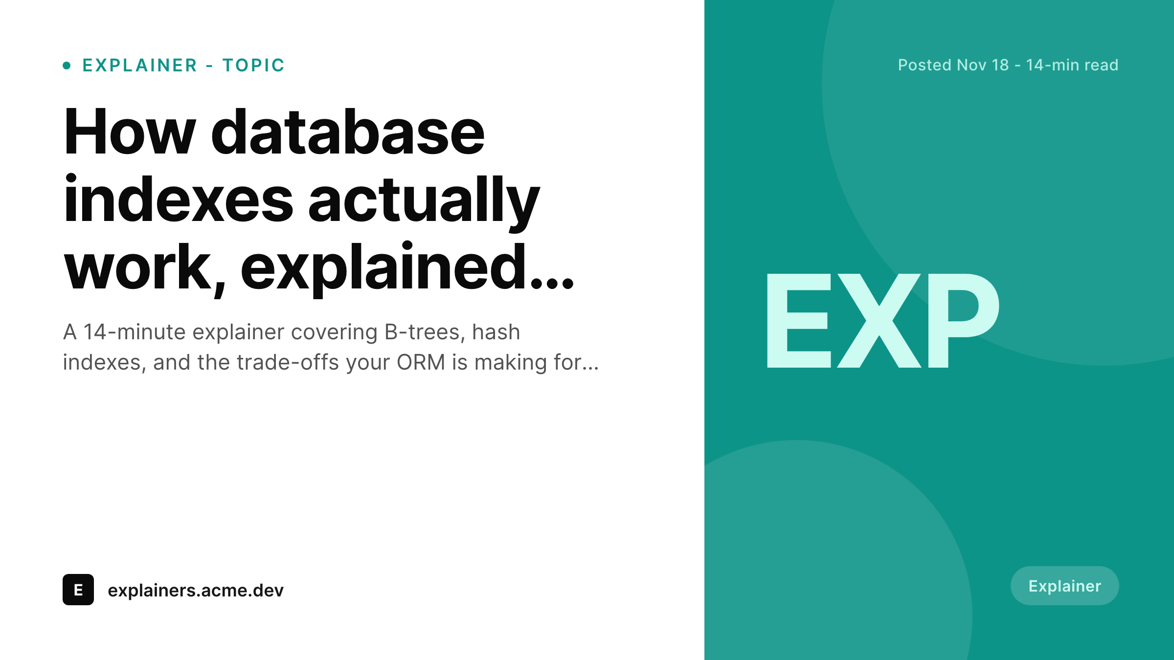
Explainer cards that signal topic, depth, and difficulty
Explainer essays are a specific format. They take a topic that has accumulated tribal knowledge or hidden complexity and break it down from first principles. The reader who clicks into an explainer is looking for clarity, not novelty. So the share card has to communicate the topic, the depth, and the difficulty level so the reader can self-select before clicking through. Most blogs use a generic featured image, which gives the reader none of that information.
SleekPixel makes the explainer card a template. Map topic, read_time, difficulty_level, and explainer_subject to the layout. The topic takes the title slot, the read time and difficulty render on the meta line, and the explainer subject sits on the badge. Difficulty levels like Beginner, Intermediate, or Advanced help readers find the explainer that matches their current understanding of the topic.
The Twitter 1200 by 675 size is the default because explainers find their audience on developer Twitter where readers actively seek out clarity content. The same template emits a 1200 by 630 OG image for the blog and a 1200 by 1200 LinkedIn card for engineering-learning reposts. The consistent composition across the explainer archive makes the series read as a coherent reference on multiple topics.
Workflow
How SleekPixel handles explainer essays
Map the explainer fields
topic, read_time, difficulty_level, and explainer_subject as the template inputs. Difficulty is a single-value field with Beginner, Intermediate, or Advanced. Read time can be computed or set manually depending on your editorial workflow.
Draft the explainer
Publish and render
Share to learning audiences
Output
Sample explainer essay card
A Twitter card for an explainer on database indexes. The topic takes the title slot, read time and difficulty render on the meta line, and the subject sits on the badge.
Comparison
Default theme OG image vs SleekPixel for explainer essay
Default theme OG image
- Default themes show a featured image with no topic or difficulty signal on the card
- Read time and difficulty level live in body text instead of rendered as visible context
- Explainer subject lacks a badge so the post does not communicate format expectations
- Each explainer needs a custom design pass because no template captures the format
- Explainer archive reads as a patchwork instead of a coherent learning reference
SleekPixel
-
Reads
topic,read_time, anddifficulty_levelfrom meta - Renders the difficulty as a colored badge (Beginner, Intermediate, Advanced)
- Emits Twitter 1200x675, OG 1200x630, and LinkedIn 1200x1200 from one template
- Updates the card automatically when explainer details change on save in WordPress
- Caches the PNG so feed unfurlers serve the same file across every share
Features
What SleekPixel gives you for explainer essay card
Topic on the title slot
The topic is the headline of an explainer because that's how readers search for the content they need. The template reserves the title slot for the topic and handles long topic names with two-line wrapping so the card stays readable at every render size across all platforms.
Difficulty on the meta line
Difficulty level filters the audience. A reader who searches for an explainer on database indexes wants to know whether the post assumes prior knowledge of B-trees or starts from zero. The meta line renders Beginner, Intermediate, or Advanced so the audience can self-select cleanly.
Read time on the meta line
Read time accompanies difficulty as a secondary signal. A 5-minute beginner explainer reads differently than a 30-minute advanced one. The template renders both side by side so the card communicates the full commitment of time and cognitive load to the reader before the click.
Use cases
Teams that publish explainer content from WordPress
Developer education sites
Education sites publish weekly or monthly explainers as part of their distribution. The template signals topic and difficulty so readers can find the explainer that matches their current learning needs without having to scroll through an unsorted archive of posts.
Reference and documentation
Reference sites that pair documentation with conceptual explainers use the template for the explainer half. The visual brand stays consistent with the doc site, but the explainer cards stand out from doc pages because the difficulty badge communicates editorial format.
Engineering team learning
Engineering teams that publish internal explainers for onboarding and team learning use the same template. The cards stay consistent across the explainer archive so a new hire reading three explainers in their first week sees the same brand and same metadata format throughout.
The bigger picture
Why explainer content benefits from a learning-focused template
Explainer essays are uniquely valuable because they convert tribal knowledge into accessible reference content. The audience for an explainer is the developer who needs to understand a topic right now to solve a problem, and they will click through if the share card promises clarity at the right difficulty level. Most blogs treat explainers as just longer blog posts and use the default share image, which fails to communicate the format.
The reader has no way to know whether the post is a beginner-friendly walkthrough or an advanced deep dive, so the click-through depends entirely on the headline. SleekPixel solves this with a template specifically designed for explainers. The difficulty badge is the key signal because it converts the share into a self-selection moment for the audience.
A reader who sees Beginner clicks if they want a refresher or onboarding content; a reader who sees Advanced clicks if they want the deep version. Both conversions are wins for the publisher. Over a year of explainers across multiple topics and difficulty levels, the archive page reads as a learning library that developers return to as a reference.
The visual consistency across the archive makes it easy to scan for the right combination of topic and difficulty, which is exactly how readers actually find explainer content when they need it. That utility compounds over time, and the long-tail traffic on a well-templated explainer archive can become one of the most valuable assets a developer brand owns.
Questions
Common questions about SleekPixel for explainer essay card
The template assigns colors to difficulty levels: Beginner renders in a soft green, Intermediate in a brand-accent blue, and Advanced in a warmer orange or red. The colors stay subtle so the card reads professionally, but the visual coding helps readers filter at a glance on the archive page.
Yes. The badge renders the explainer subject which can be a top-level category like Database or a more specific subject like Database Indexes. Use a taxonomy if you need hierarchical filtering on the archive page, or a flat meta field if subjects are mostly distinct and non-overlapping.
Yes. The format is the same (X-min read) so the cards across explainers, longform articles, and essays all use the same read-time convention. That consistency helps readers compare commitments across content types when browsing or searching the site from external sources.
Yes. Use a part_number meta field for multi-part explainers like a four-part series on distributed consensus. The badge area renders Part 2 of 4 so readers see the series structure on the card. Each part keeps its own difficulty and read time as separate values.
Each version becomes a separate explainer post with its own card. Beginner, Intermediate, and Advanced explainers on the same topic can share the same explainer_subject and category but have distinct posts. The archive page can group related explainers under one topic for easier navigation.
Yes. The post body can list related explainers, and the page-group template renders a Related explainers section at the bottom. The same template across all related cards makes the related-content area read as one coherent set of recommendations rather than scattered suggestions.
Yes. The card represents the post regardless of the medium. If the explainer includes an embedded video or an interactive widget, the card still renders with the topic, difficulty, and read time. The medium meta can render a small icon on the badge to indicate video or interactive content.
Yes. The first render after publish stores the PNG and serves it on subsequent requests. Editing the explainer meta invalidates the cache and triggers a regeneration so the file always reflects the current topic, difficulty, and read time as stored on the post meta fields.
Pricing
More than 1000+
happy customers
Explore our flexible licensing options tailored to your needs. Upgrade your license anytime to access more features, or opt for a lifetime license for ongoing value, including lifetime updates and lifetime support. Our hassle-free upgrade process ensures that our platform can grow with you, starting from whichever plan you choose.
Lifetime ♾️
Most popular
EUR
once
- Unlimited websites
- Lifetime updates
- Lifetime support
...or get the Bundle Deal
and save €250 🎁
The Bundle (unlimited sites)
Pay once, own it forever
Elevate your WordPress site with our exclusive plugin bundle that includes all of our premium plugins in one package. Enjoy lifetime updates and lifetime support. Save significantly compared to buying plugins individually.
What’s included
-
SleekAI
-
SleekByte
-
SleekMotion
-
SleekPixel
-
SleekRank
-
SleekView
€749
Continue to checkoutBrowse more
- certification announcement cards
- industry update cards
- regex card
- AMA card
- build in public cards
- research report images
- feature press card
- holiday greeting cards
- LinkedIn update cards
- monthly roundup cards
- weekend project card
- Hacker News launch card
- term explained cards
- Reddit post card
- press release cards
- KakaoTalk channel banners
- YouTube Music cover art
- Shopify collection banners
- X Space banners
- Instagram grid tiles
- Twitter card images
- Buy Me a Coffee banners
- TikTok ad images
- Instagram Reels covers
- Discord stage banner
- LinkedIn post images
- Etsy shop banners
- Patreon cover images
- TikTok shop images
- Discord server banners