






SleekPixel for beta invite cards
SleekPixel pulls the program name, seat count, eligibility line, and close date from a single beta post and renders a Twitter-card-ready invitation. Friends-of-the-product and power users see a real beta in their feed instead of a vague 'sign up for updates' tweet.
♾️ Lifetime License available
Beta programs need a visible front door
Closed betas live or die by who shows up in the first week. The fastest way to fill 100 high-quality seats is to put the invitation in front of people who already follow the product on social. The slowest way is to email a list. The graphic that travels on social is the difference between those two paths, and most teams either skip the graphic entirely or commission a designer for a single-use asset.
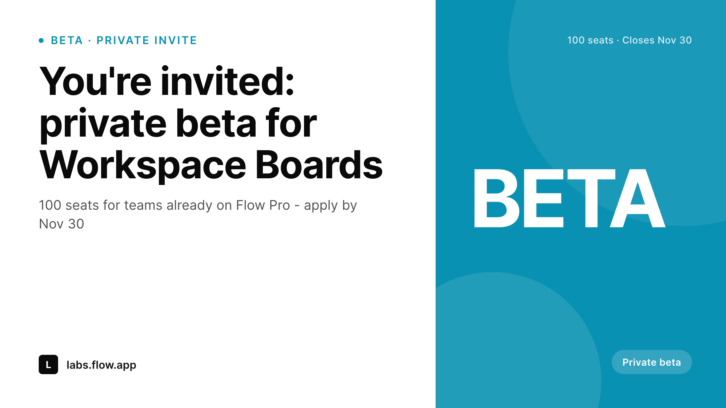
SleekPixel reads the beta post's program_name, seat_count, eligibility, and close_date fields, then renders a 1200x675 Twitter card. The program name and seat count are immediately visible. The eligibility and close date appear as sub-lines. The full beta description and application form stay in the post body.
Run multiple betas a quarter, and one template handles them all. Visual consistency makes each new beta feel part of a deliberate program rather than a one-off pitch, which is exactly what serious product teams want to project.
Workflow
How a card renders, end to end
Create the beta post
beta CPT post. Fields: program name, seat count, eligibility criteria, close date, application form URL.
Bind the template
Save
Distribute and update
Output
Sample private-beta invite card
Rendered from a single beta post: program name, seat count, eligibility line, and close date. The application form lives in the post body.
Comparison
Default twitter card vs SleekPixel for beta invite cards
Plain product update OG image
- Beta invites get the site's default OG image, hiding the actual offer
- Manual design per beta scales badly when running multiple programs
- Seat counts in the post and the share image drift after invitations go out
- Close dates lag actual program end when designers are not in the loop
- No visual rhythm across a series of betas, each looks like a one-off
SleekPixel
-
Reads
program_name,seat_count,eligibility,close_date - Seat-count region renders as large numerical text, legible at thumbnail size
- Eligibility line in the sub-headline helps applicants self-screen
- Twitter-card 1200x675 plus a 1080x1080 LinkedIn variant
- Falls back to program-name-only headline if seat count is unset
Features
What SleekPixel gives you for beta invite card
Beta-aware layout
The template highlights the program name and the seat count - the two things applicants care about most. Eligibility and close date appear as supporting lines, not buried in the post body.
Deadline-explicit
The close date is visible. Applicants see urgency in feeds, which lifts application rates measurably compared to open-ended sign-up posts.
Series consistency
Run a Q3 beta, a Q4 beta, an early-2026 beta - the same template renders all three. The visual rhythm signals a real beta program, not a single experiment.
Use cases
Where this card belongs
Twitter / X recruitment
Product teams tweet the beta post; the card carries the invitation forward in feeds and quote-tweets. Application rates rise when the seat count is visible at thumbnail size.
Customer email
Embed the card in the existing customer newsletter. Eligible applicants see the program name and dates before they decide to click.
Customer-success outreach
CSMs forward the card to high-value accounts when targeting design partners. The card looks like a real product asset, not a Slack DM.
The bigger picture
Why beta invitations earn their own template
Closed betas are one of the highest-leverage product moments. Filling 100 seats with the right kind of user can shape the feature's roadmap for a year. The cost of the wrong fill - 100 users who do not match the target persona - is harder to measure but real.
Visibility on social is the first filter. A beta invite that travels well on X and LinkedIn reaches power users who already follow the product, which is exactly the cohort with the highest signal-to-noise. The card itself does the filtering work that an email blast cannot.
Seat counts visible at thumbnail size let applicants understand scarcity, which encourages serious applications. Eligibility lines let them self-screen out of programs they do not match. Close dates create urgency without sounding pushy.
Each of these is a small piece of psychology built into the visual format, and each one improves the quality of the resulting cohort. Multiplied across the four or five betas a real product team runs in a year, the compounded effect is a beta program that consistently fills with high-quality users, all driven by one template that renders on save.
Questions
Common questions about SleekPixel for beta invite card
The card itself is public when the post is public. To restrict, gate the post behind a paywall, login, or invitation flow; SleekPixel still renders the card but only authenticated visitors can land on the post URL.
Yes. Update the seat-count field and save. Many teams add a seats_remaining region that updates as applications are approved, signaling scarcity dynamically.
Yes. A status field with open or closed values routes to two template variants. The closed variant uses a muted accent and a 'Beta closed' badge.
The PNG cannot embed a form. But the host post page does, and the card directs applicants to scroll for the application or click the post URL.
Run two beta posts with different copy and different SleekPixel template variants. Compare application rates per post. Most teams pick a winner after the first 50 applications.
Yes. Different eligibility lines come from different field values; SleekPixel renders accordingly. Some teams run two posts per beta, one targeting each plan tier.
Optional. Add an invite_code field bound to a small footer region. Note that public cards expose the code globally, so use it only when codes are intentionally shareable.
Yes - both platforms read og:image from the post URL. The 1200x675 ratio renders cleanly in both.
Pricing
More than 1000+
happy customers
Explore our flexible licensing options tailored to your needs. Upgrade your license anytime to access more features, or opt for a lifetime license for ongoing value, including lifetime updates and lifetime support. Our hassle-free upgrade process ensures that our platform can grow with you, starting from whichever plan you choose.
Lifetime ♾️
Most popular
EUR
once
- Unlimited websites
- Lifetime updates
- Lifetime support
...or get the Bundle Deal
and save €250 🎁
The Bundle (unlimited sites)
Pay once, own it forever
Elevate your WordPress site with our exclusive plugin bundle that includes all of our premium plugins in one package. Enjoy lifetime updates and lifetime support. Save significantly compared to buying plugins individually.
What’s included
-
SleekAI
-
SleekByte
-
SleekMotion
-
SleekPixel
-
SleekRank
-
SleekView
€749
Continue to checkoutBrowse more
- Mastodon post images
- Kick channel banners
- Twitch panel images
- X community banners
- Farcaster cast images
- Bluesky link cards
- YouTube Shorts cover
- Instagram stories
- Telegram channel cover images
- Facebook cover photos
- LinkedIn carousel slides
- Apple Podcasts covers
- LinkedIn event banners
- Tumblr header
- X Space banners