






SleekPixel for OKR recap cards: quarter close shares
An OKR recap is the bookend that closes a quarter of public weekly updates. SleekPixel reads the quarter, the final progress percentage, and the closed-out date from custom fields and composes a LinkedIn card that signals the quarter ended with substance, not just a tweet thread.
♾️ Lifetime License available
Quarter close needs a card that matches the moment
An OKR recap post is the most-read OKR post of the quarter. After thirteen weeks of progress updates, the audience reads the recap to find out which objectives shipped, which slipped, and what the team learned. The post body carries that breakdown in detail, often with charts and per-objective writeups. The share image rarely matches the gravity of the post because it is the same banner the team has been using for every weekly update. SleekPixel handles the case with a dedicated recap preset that signals the quarter close visually.
The setup uses three custom fields: quarter for the corner mark like Q2, final_pct for the headline final progress percentage, and objectives_delivered for an optional subhead detail like '2 of 4 fully shipped.' The accent is a slightly deeper purple than the weekly OKR update preset to mark the recap as distinct from the in-flight updates. The card is square at 1200 by 1200 to fit LinkedIn and stack visually with the weekly cards.
The post body carries the full per-objective recap, the lessons learned, and the carry-forwards into the next quarter. The card carries the headline data and signals the quarter close. Over multiple quarters, the recap cards line up as the structural milestones in the team's OKR history, with the weekly cards filling in between them. The two-tier visual hierarchy (weekly card vs recap card) makes the quarter close immediately recognisable.
Workflow
From quarter close to OKR recap card
1. Add recap custom fields
quarter, final_pct, and objectives_delivered as custom fields on the OKR recap post. The fields capture the three credibility-defining facts of a quarter close: which quarter, what overall percentage, and how many objectives fully shipped.
2. Pick the OKR recap template
3. Publish the recap post
4. Bookend the weekly stream
Output
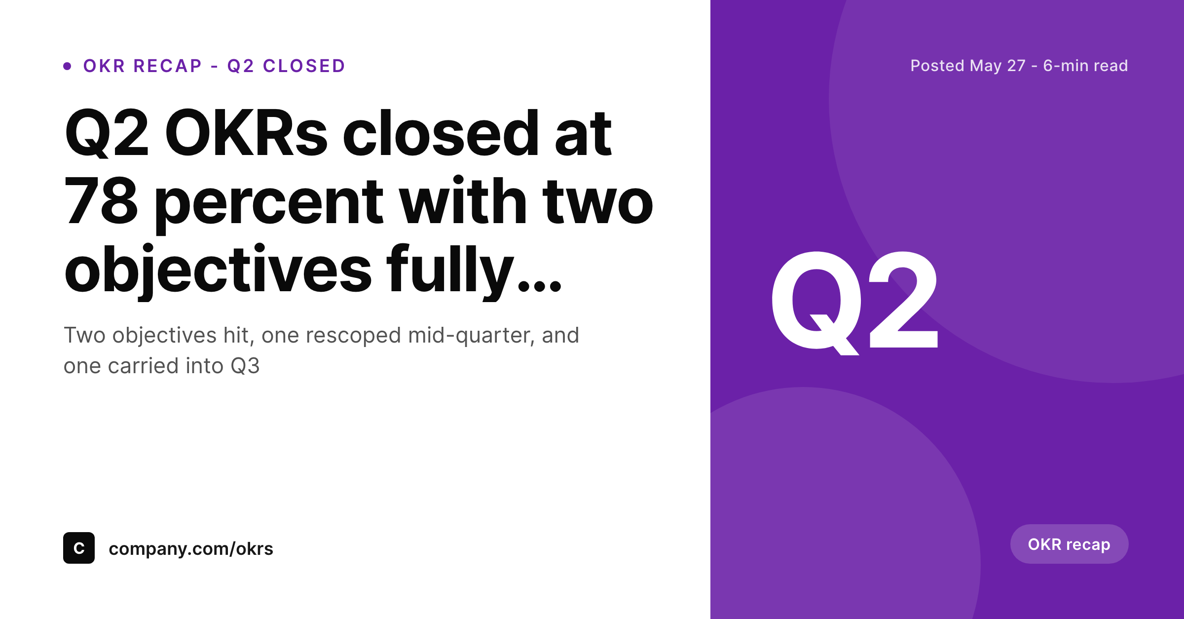
Sample OKR recap card
A LinkedIn card with the recap headline, the final progress percentage in the subhead, the Q2 corner mark, and the objectives-delivered count anchored on the footer line.
Comparison
Default theme OG image vs SleekPixel for OKR recap cards
Default theme OG image
- Uses the weekly OKR banner so the recap does not stand out from the in-flight updates
- Cannot show the final progress percentage, which is the headline of any quarter close
- Misses the objectives-delivered count, which is the credibility signal of the recap
- Treats recaps as routine, which mismatches the higher attention they get from stakeholders
- Forces a designer to make a one-off quarter-close graphic at exactly the busiest week
SleekPixel
-
Maps
quartercustom field to the corner mark asQ1throughQ4 -
Renders
final_pctin the subhead as the headline final progress percentage -
Surfaces
objectives_deliveredon the footer for the per-objective credibility signal - Uses a deeper purple accent to distinguish recap cards from weekly OKR update cards
- Composes deterministically on save so quarter close never bottlenecks on design
Features
What SleekPixel gives you for OKR recap card
Final progress percentage in the subhead
The subhead renders final_pct directly so the card surfaces the headline quarter result like '78 percent overall, two objectives at 100 percent.' That single number gives stakeholders a quick read on the quarter's execution before they click through to the per-objective breakdown.
Objectives delivered on the footer
The footer carries objectives_delivered as a short summary like '2 of 4 fully shipped.' That detail communicates both the wins and the gaps in one phrase, which is more honest than a single percentage and more readable than a per-objective list on a small card.
Quarter mark in the corner
The corner mark renders the quarter from quarter as Q1, Q2, Q3, or Q4. The recap cards line up as quarter-end milestones in the historical feed, with the weekly update cards filling in between them, creating a two-tier visual hierarchy that maps directly to the OKR cycle.
Use cases
Where OKR recap cards travel
Quarter-close LinkedIn posts
Executives sharing the quarter recap on LinkedIn use the card to mark the close visibly. The deeper accent and the prominent final percentage separate the recap from the weekly stream, which gives stakeholders a clear bookend on the quarter's execution.
Investor quarterly letters
Quarterly investor letters embed the OKR recap card alongside the financial summary. The card carries the final progress percentage into the Slack and email previews of the letter, which makes the embedded reference feel substantive rather than generic.
Internal all-hands recaps
Posting the recap URL in the company-wide Slack channel surfaces the card as the team's quarter-end statement. The card communicates the final result visually, which sets the tone for the all-hands meeting where the per-objective recap gets discussed in more detail.
The bigger picture
Quarter close is the moment the OKR program earns its keep
Public OKR programs build trust over many quarters, but the trust crystallises at the recap. The weekly updates establish the cadence; the recap proves the team can close out what it committed to. Stakeholders read the recap with a different attention than they read the weekly updates, because the recap is the moment when the quarter's promises are reconciled against the quarter's reality.
The share image has to match that attention. A recap that ships with the same banner as week three has nothing to signal the close, so the audience does not realise they should be reading more carefully. SleekPixel solves this by making the recap card visually distinct.
The accent is deeper, the final progress percentage is in the subhead, and the objectives-delivered count is in the footer. The corner mark stays Q2 to anchor the card in the quarter, but the rest of the layout signals 'this is the close, not another in-flight update.' Over multiple quarters, the recap cards become the structural milestones in the team's OKR history. A candidate browsing the team's blog sees four recap cards from the previous year, each marking the end of a quarter with a final percentage and a number of shipped objectives.
That visible track record is more convincing than any single post because it shows the cadence sustained over time. SleekPixel makes the track record almost free to maintain because the recap card composes from the same kind of custom fields the weekly cards use, which means the team can sustain the program for years without ever asking a designer to draw a quarter-close graphic. The cadence and the visual record reinforce each other indefinitely, which is the architecture that public OKR programs need to actually pay off.
Questions
Common questions about SleekPixel for OKR recap card
Three fields cover the standard case: quarter for the corner mark, final_pct for the subhead headline, and objectives_delivered for the footer summary. Together they capture the three credibility-defining facts of any quarter close: which quarter, the final progress, and how many objectives fully shipped.
The recap preset uses a deeper purple accent to signal the quarter close visually. The subhead carries the final progress percentage rather than the week number, and the footer carries the objectives-delivered count rather than the in-flight progress. The corner mark stays the same to anchor the card in the quarter.
The card surfaces a single objectives-delivered count to stay legible at feed sizes. Per-objective recaps belong in the post body where each objective can carry its own writeup, chart, and lesson. The card opens the recap visually; the body delivers the full breakdown.
Use the objectives-delivered field to communicate the split, like '2 of 4 fully shipped, 1 carried to Q3.' The footer accepts free-form text, so the recap can honestly communicate the carry-forwards alongside the shipped objectives. Honesty in the recap reinforces the credibility of the program.
Yes, and most teams use a slightly deeper variant of the weekly accent to mark the recap as distinct without breaking the visual continuity of the OKR program. The recap should feel like an evolution of the weekly cards, not a separate visual identity, which is why the accents are related rather than contrasting.
Yes. The quarter field is a free string, so H1, 2026, or any other cycle label works. The corner mark renders whatever you supply, and the rest of the layout adjusts to whatever cycle length your team uses, including semi-annual, annual, or sprint-based OKR cadences.
The card focuses on typography because charts at small card sizes lose detail and become illegible. The detailed chart belongs in the post body where it can be sized appropriately and read carefully. The card carries the headline percentage; the chart carries the path that produced it.
In the WordPress media library, attached to the recap post as the featured image. The same file powers the OG image, the Twitter image, and the RSS thumbnail, so every consumer of the post URL surfaces the same recap card with the final percentage and the objectives-delivered count clearly visible.
Pricing
More than 1000+
happy customers
Explore our flexible licensing options tailored to your needs. Upgrade your license anytime to access more features, or opt for a lifetime license for ongoing value, including lifetime updates and lifetime support. Our hassle-free upgrade process ensures that our platform can grow with you, starting from whichever plan you choose.
Lifetime ♾️
Most popular
EUR
once
- Unlimited websites
- Lifetime updates
- Lifetime support
...or get the Bundle Deal
and save €250 🎁
The Bundle (unlimited sites)
Pay once, own it forever
Elevate your WordPress site with our exclusive plugin bundle that includes all of our premium plugins in one package. Enjoy lifetime updates and lifetime support. Save significantly compared to buying plugins individually.
What’s included
-
SleekAI
-
SleekByte
-
SleekMotion
-
SleekPixel
-
SleekRank
-
SleekView
€749
Continue to checkoutBrowse more
- LinkedIn article covers
- Lens Protocol posts
- Snapchat ad images
- Lemon Squeezy product covers
- LinkedIn showcase page banners
- YouTube channel banners
- Depop listing images
- TikTok cover images
- Instagram highlight covers
- X Space banners
- Snapchat Spotlight covers
- Bluesky profile banner
- Instagram bio link banners
- Odnoklassniki banners
- Twitch offline banners