SleekPixel for Google Sheets
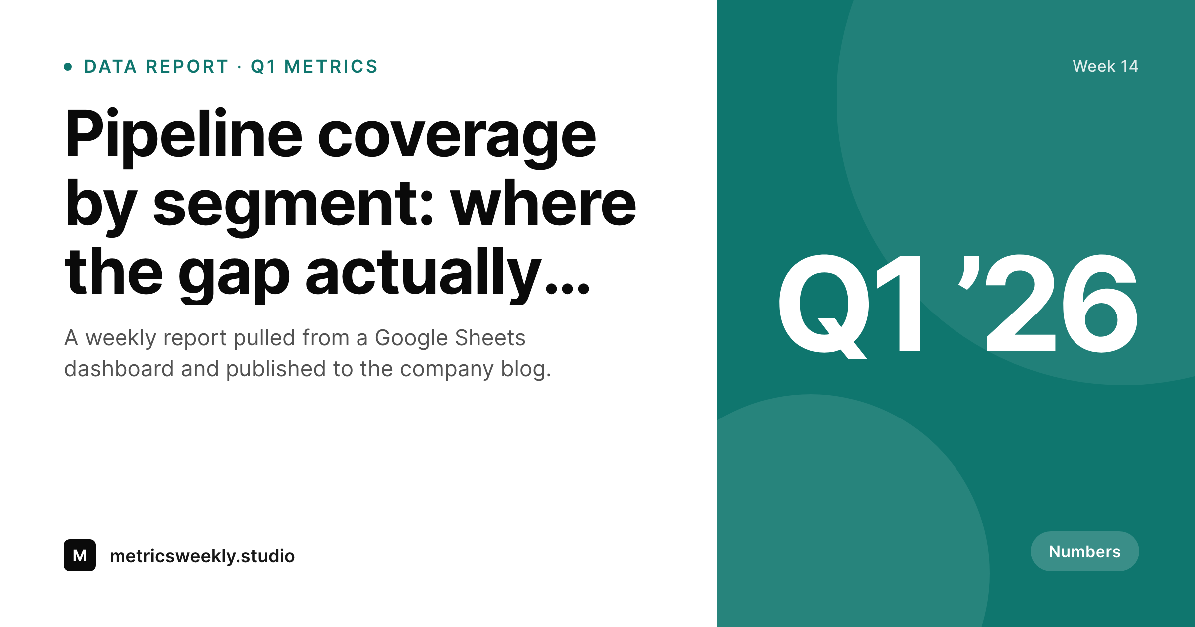
Teams who publish weekly or quarterly reports from Google Sheets to a WordPress blog get a clean share card per report on save, with the period and report title visible on the unfurled link.
♾️ Lifetime License available
Sheets is the source of truth, WordPress is the audience
Operations, marketing, and analytics teams run a remarkable amount of their reporting out of Google Sheets. Pipeline reviews, retention dashboards, marketing funnel weeklies, all of them live as Sheets, and many of them get summarised into a WordPress post for either an internal audience on an intranet or an external one on the public blog. The Sheets-to-WordPress handoff is usually a screenshot or a hand-typed summary, never an automated visual export of the dashboard itself.
The share image on the resulting WordPress post is the part that almost always misses. Either the post lands with a screenshot of the dashboard as the featured image, which looks rough as a 1200 by 630 unfurl, or the post lands with no specific share preview at all and gets the theme default. SleekPixel renders a clean composition on save: the report title, the period covered, the author, and a small accent block that can carry a single headline metric pulled from a custom field. The result is a card that reads as a numbers report without dumping the actual numbers into the unfurled link.
For teams who want to surface a single headline number on the card, the template can read a custom field on the WordPress post and place the value as a large central element. A 'Q1 pipeline coverage at 1.8x target' summary number lands in the card corner without exposing the underlying dashboard. The Sheets side keeps doing what it does best, structured data, and the WordPress side ships a share preview that respects the seriousness of the report.
Workflow
From Sheets dashboard to share-ready report
Build the dashboard in Sheets
Write the recap in WordPress
Save the post
Share on social or intranet
Output
What gets generated per report post
A 1200 by 630 OG and Twitter card with the report title, the period covered, the author byline, and an optional headline metric pulled from post meta.
Comparison
Sheets screenshot versus SleekPixel
Sheets screenshot as OG
- Sheets screenshot used as the OG image looks unreadable at 1200 by 630 thumbnail size
- Headline metric from the dashboard never lands on the unfurled link
- Report period like 'Q1 2026' or 'Week 14' is invisible on the share preview
- Author byline misses on the share card so the report reads as unowned
- Visual consistency across a weekly report series drifts after the third or fourth post
SleekPixel
- Renders a clean 1200 by 630 card on save inside WordPress, no Sheets export needed
- Report period, author byline, and optional headline metric all surface on the card
- Headline metric reads from a custom field on the WordPress post and lands in the template corner
- Brand template enforces consistent identity across the entire report series
- Bulk regenerate covers a year of weekly reports in one WP-CLI command
Features
What SleekPixel gives you for Google Sheets
Numbers-aware composition
Template reads a headline metric from post meta and places it as a large element. 'Pipeline coverage 1.8x target' lands on the card without dumping the full dashboard.
Period chip
The report period, Q1, Week 14, March, surfaces as a small chip on the card so readers see the time horizon without opening the post.
Author attribution
The report author appears in the bottom band with their photo if available. The share preview reads as authored, not as scraped from a faceless dashboard.
Use cases
Where reporting teams benefit
Pipeline weeklies
Revenue ops teams publishing weekly pipeline coverage reports get a per-week share card with the week number and headline number visible on the unfurl.
Marketing dashboards
Marketing teams shipping monthly funnel reports from a Sheets dashboard get a per-month share card that respects the brand template and shows the lead-source mix.
Research notes
Analytics teams publishing quarterly research notes from a Sheets data pull get share cards that show the research period and headline finding on the card itself.
The bigger picture
Why dashboards do not make good share images
Sheets dashboards are designed to be read at full screen with the eye scanning rows and columns, and they assume the reader knows the structure of the data. None of that survives the compression to a 1200 by 630 thumbnail in a feed. A screenshot of a dashboard at thumbnail size is unreadable, and worse, it communicates that the team did not think about the share preview.
The first reason a clean composed share card matters is legibility, the unfurled link has to read at thumbnail size in a hurry. The second reason is signal. A clean card with a clear headline metric tells the reader before they click whether the report is worth their next two minutes, and the right headline metric is much more compelling than a tiny screenshot of a chart.
The third reason is consistency across a series. Teams running weekly or quarterly report programmes build authority through visual consistency, and a manually screenshotted dashboard breaks that consistency by definition because every dashboard image is different. Composed share cards stay consistent forever, while the Sheets side keeps doing what it does best, real numbers in a real spreadsheet.
Questions
Common questions about SleekPixel for Google Sheets
No. SleekPixel does not call the Sheets API. The headline metric lives as a custom field on the WordPress post, populated either by hand or by an internal script that already pulls data from Sheets into WordPress.
Charts at thumbnail size are unreadable, so SleekPixel does not try to render one. Instead, the template shows the single most important metric as a large element. If you really need a chart, you can render one server-side and reference the PNG in the template.
The template falls back to a clean title-only composition with the period chip and author byline. The card still reads professionally without a number, just less data-forward.
Yes, if a co-author plugin is installed. SleekPixel reads the byline string and shows two author names on the card. Most reporting teams have a single primary author per report, but the multi-author path works.
Yes. The period chip reads from a post meta field, so you can populate it with any string, Week 14, Q1, March, FY26-H1. The template renders whatever string you give it.
Every WordPress save regenerates the card. Update the headline metric on the post, save, the card rebuilds. If the underlying Sheets data shifts but the recap post does not get edited, the card stays as it was at last save.
Private posts and intranet content render the same way. The og:image tag still updates on the post, and any internal share, Slack, intranet feeds, picks up the rendered card.
Yes. The bulk regenerate WP-CLI command walks every report post and renders fresh cards with the current template. A year of weekly reports rebuilds in minutes.
Pricing
More than 1000+
happy customers
Explore our flexible licensing options tailored to your needs. Upgrade your license anytime to access more features, or opt for a lifetime license for ongoing value, including lifetime updates and lifetime support. Our hassle-free upgrade process ensures that our platform can grow with you, starting from whichever plan you choose.
Lifetime ♾️
Most popular
EUR
once
- Unlimited websites
- Lifetime updates
- Lifetime support
...or get the Bundle Deal
and save €250 🎁
💎 Want everything forever? The All Access Pass is going away on 01.08.2026.
The Bundle (unlimited sites)
Pay once, own it forever
Elevate your WordPress site with our exclusive plugin bundle that includes all of our premium plugins in one package. Enjoy lifetime updates and lifetime support. Save significantly compared to buying plugins individually.
What’s included
-
SleekAI
-
SleekByte
-
SleekMotion
-
SleekPixel
-
SleekRank
-
SleekView
€749
Continue to checkoutBrowse more
- Twitch profile banner
- Twitter card images
- LinkedIn banner images
- Instagram grid tiles
- X list banners
- Tumblr header
- Slack channel headers
- Dailymotion thumbnails
- Patreon tier images
- KakaoTalk channel banners
- Twitch offline banners
- Twitch schedule banners
- Substack post thumbnail
- Kick stream thumbnails
- Klaviyo email headers