






SleekPixel for OKR update cards: quarterly progress posts
Companies that publish OKR progress publicly want the share image to communicate the quarter, the week, and the overall progress percentage. SleekPixel reads each from custom fields and composes a LinkedIn card with a quarter mark in the corner and the progress detail in the subhead.
♾️ Lifetime License available
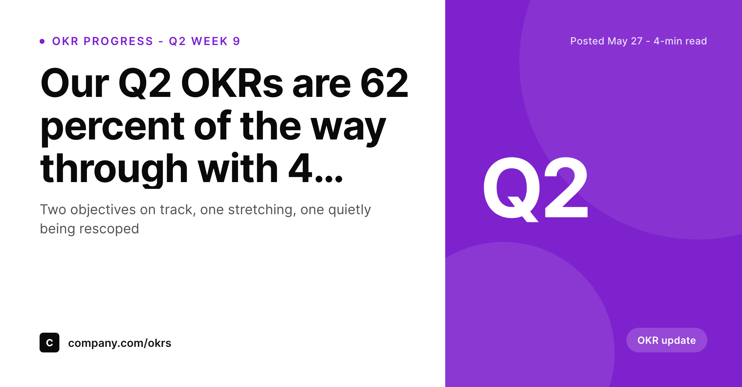
OKR progress posts are weekly, the card has to keep up
Teams that publish OKR progress publicly usually post a weekly or biweekly update through the quarter. Each post reports the same kind of information: which objectives are on track, which are slipping, and what the team is doing about each. The cadence is the whole point, because steady updates compound into trust with stakeholders, candidates, and external observers. The default share image cannot keep up with that cadence because nobody designs a fresh banner every two weeks. SleekPixel solves this by treating the OKR update as a structured post with custom fields driving the card.
The setup uses three custom fields: quarter for the corner mark like Q2, week_number for a subhead detail like 'week 9 of 13,' and progress_pct for an optional second subhead line. The accent is a calm purple that signals planning and strategy rather than marketing. The card is square at 1200 by 1200 for LinkedIn, where most OKR updates land.
The post body carries the per-objective breakdown: which KRs hit their checkpoint, which are behind, and what the response is. The card carries the headline progress and the quarter mark. Over a full quarter, the series of cards reads as a chronological record of the team's execution, which is exactly the artifact that gives OKR transparency its credibility.
Workflow
From OKR check-in to weekly card
1. Add OKR custom fields
quarter, week_number, and progress_pct as custom fields on the OKR update post or post category. The three fields capture the three structural facts that every weekly OKR update needs to surface visually.
2. Pick the OKR update template
3. Publish each weekly update
4. Maintain the cadence
Output
Sample OKR progress card
A LinkedIn card with the quarterly progress headline, the week number in the subhead, the Q2 corner mark, and the overall progress percentage visible on the footer line.
Comparison
Default theme OG image vs SleekPixel for OKR update cards
Default theme OG image
- Treats weekly OKR posts as routine and uses the same banner across all of them
- Cannot show the quarter or week, so updates from different points blur together
- Misses the overall progress percentage, which is the headline number stakeholders want
- Forces a manual graphic per week, which is unsustainable across a 13-week quarter
- Breaks the cadence the moment a designer is unavailable mid-quarter
SleekPixel
-
Maps
quartercustom field to the corner mark asQ1throughQ4 -
Renders
week_numberin the subhead as 'week 9 of 13' or similar -
Surfaces
progress_pcton the footer as the overall progress signal - Uses a calm purple accent appropriate for strategy and planning content
- Composes deterministically on save so weekly cadence never bottlenecks on design
Features
What SleekPixel gives you for OKR update card
Quarter mark in the corner
The corner mark renders the quarter from quarter as Q1, Q2, Q3, or Q4. The series organises the OKR update stream by quarter, which is the natural unit of OKR planning, and makes it easy to find updates from a specific quarter when browsing the team category later.
Week number in the subhead
The subhead surfaces the week number from week_number as 'week 9 of 13' or 'week 4 of 12.' That single line communicates how far through the quarter the team is and how much time is left, which is the second-most read fact after the overall progress percentage.
Progress percentage as the headline
The progress percentage from progress_pct renders on the footer line as 'overall 62 percent on track' or similar. The percentage gives stakeholders a single number to track quarter over quarter, even though the per-objective detail lives in the post body itself.
Use cases
Where OKR update cards earn the most engagement
LinkedIn weekly OKR posts
Founders and executives who post weekly OKR updates use the card to maintain visual consistency across a 13-week stream. The cards line up cleanly in the feed, which makes the cadence visible as a discipline rather than a one-off post.
Internal company-wide updates
Posting the OKR update URL in the company Slack surfaces the card with the quarter and progress data. Teammates see the headline at a glance before clicking through to read the per-objective breakdown for their team's contribution.
Investor update embedded views
Quarterly investor updates link back to the weekly OKR posts. The card carries the quarter mark and progress percentage into the Slack and email previews, which makes the embedded reference more credible than a generic linkback.
The bigger picture
Public OKR cadence is a trust-building discipline
Teams that publish OKR progress publicly are signing up for a specific discipline: a weekly or biweekly post for thirteen weeks, then another quarter, then another. The audience that values these posts, mostly investors, candidates, and observers from other companies, tracks the cadence as carefully as they track the content. A team that ships a week-three post and skips week four loses trust because the irregularity reads as either chaos or selective reporting.
The share image is a surprisingly large part of maintaining the cadence because it removes one of the friction points: nobody has to make a graphic before the post can ship. SleekPixel handles the card automatically from the custom fields, so the only work per post is writing the body and updating three field values. Over a quarter, that means thirteen consistent cards stacked in the LinkedIn feed.
The series itself becomes a visual proof of the discipline, more convincing than any individual post could be. A candidate browsing the team's profile sees twelve weeks of OKR updates from Q2, each with the same accent, the same corner mark, and a different week number. The visual continuity reinforces the cadence and the cadence reinforces the trust.
SleekPixel makes that whole loop possible because it removes the design bottleneck that derails most public OKR programs in the second month. Without the bottleneck, the team can sustain the cadence across multiple quarters, which is the only timeframe over which public OKRs actually build credibility.
Questions
Common questions about SleekPixel for OKR update card
Three fields cover the standard case: quarter for the corner mark, week_number for the subhead, and progress_pct for the footer. Together they capture where the team is in the quarter and how the work is tracking, which is the three-part summary every weekly OKR post needs.
The card surfaces the overall progress percentage to keep the layout legible. Per-objective progress belongs in the post body where each objective can carry its own breakdown. The card sets up the headline; the body delivers the detail. Both surfaces work together rather than competing for limited card space.
Use the quarter field to capture whatever period your team plans against, like H1 for a half-year cycle or S26 for a sprint-based system. The corner mark renders whatever you supply, and the template adjusts the subhead to match the cycle length you specify in the planning configuration.
By default the field is a free string, so use whatever convention your team prefers: 9 of 13, week 9, or W9. The subhead renders whatever value you supply. Most teams use the 'X of Y' format because it communicates both the position and the total length of the quarter.
Yes. The footer can render a status indicator alongside the progress percentage by adding a status field and configuring the SleekPixel template to map it. Most teams keep the card to the numeric progress and let the body carry the qualitative color-coding, because colors are easier to misread on a small card.
Publish a final wrap-up post for the quarter with the close-out figures, then start a new sequence for the next quarter with a fresh Q3 corner mark. The historical Q2 cards remain attached to their original posts as a permanent record of the quarter's execution path.
Yes. Some teams rotate the accent each quarter to make the quarters visually distinct in the historical feed. Most keep one accent across all quarters to maintain a single OKR program identity. Both approaches are supported by the SleekPixel template configuration without changing the underlying layout.
In the WordPress media library, attached to the OKR update post as the featured image. The same file powers the OG image, the Twitter image, and the RSS thumbnail, so every consumer of the post URL sees the same card with the current week number and progress percentage.
Pricing
More than 1000+
happy customers
Explore our flexible licensing options tailored to your needs. Upgrade your license anytime to access more features, or opt for a lifetime license for ongoing value, including lifetime updates and lifetime support. Our hassle-free upgrade process ensures that our platform can grow with you, starting from whichever plan you choose.
Lifetime ♾️
Most popular
EUR
once
- Unlimited websites
- Lifetime updates
- Lifetime support
...or get the Bundle Deal
and save €250 🎁
The Bundle (unlimited sites)
Pay once, own it forever
Elevate your WordPress site with our exclusive plugin bundle that includes all of our premium plugins in one package. Enjoy lifetime updates and lifetime support. Save significantly compared to buying plugins individually.
What’s included
-
SleekAI
-
SleekByte
-
SleekMotion
-
SleekPixel
-
SleekRank
-
SleekView
€749
Continue to checkoutBrowse more
- Linktree banner image
- YouTube banner art
- Pinterest product pin covers
- Weibo post images
- Facebook event covers
- LinkedIn article covers
- LinkedIn banner images
- Buy Me a Coffee banners
- Substack post thumbnail
- KakaoTalk channel banners
- Lens Protocol posts
- Snapchat ad images
- Dailymotion thumbnails
- LINE official account banners
- Twitch panel images