






SleekPixel for side project cards: indie hacker shares
Indie makers ship side projects on weekends and need a share card that reads as authentic, not corporate. SleekPixel reads the project name, the weekends invested, and the repo URL from custom fields and composes a tight Twitter card that signals craft without performing it.
♾️ Lifetime License available
Side projects deserve cards that feel made, not branded
Side projects live in a different visual register than company launches. A founder sharing 'we raised a Series B' wants a corporate card. An indie maker sharing a weekend build wants something that signals personal craft, not marketing budget. The default theme OG image is wrong for both, but it is especially wrong for side projects because it screams 'agency template' at exactly the audience that wants to see authenticity. SleekPixel handles the case with a preset tuned for indie hackers and weekend builders.
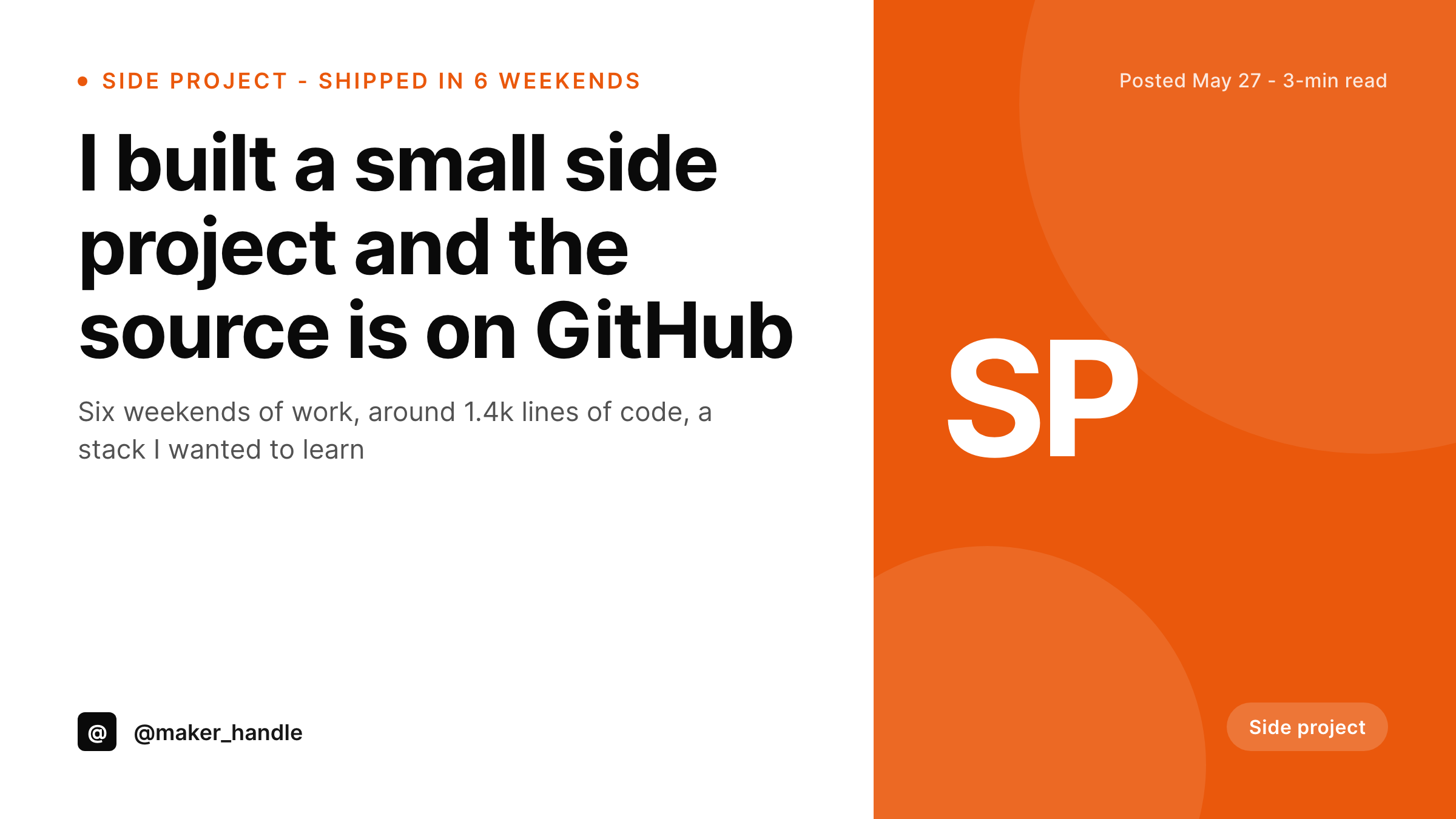
The setup uses three custom fields: weekends_invested for a subhead detail like '6 weekends,' line_count for an optional line in the footer like '1.4k lines,' and repo_url for the brand slot or a footer anchor pointing at the GitHub repo. The corner mark is a short SP by default, or any two-letter code the maker prefers. The accent color is the maker's personal accent, usually warmer than a corporate brand, because side projects benefit from feeling human.
The card composes on save and replaces the featured image like any other SleekPixel preset. The difference is in the template choices: tighter line height, smaller corner mark, no excessive whitespace, and a brand slot that reads as a handle (@maker_handle) rather than a domain. The result reads as a personal share rather than a marketing tile, which is exactly the register the audience expects.
Workflow
From weekend build to share card
1. Add project custom fields
weekends_invested, line_count, and repo_url as custom fields on the side project post. The fields are short strings that the template reads into the subhead, footer, and brand-slot positions.
2. Pick the side project template
3. Publish the launch post
4. Share to the maker audience
Output
Sample side project share card
A Twitter card with the project name as the headline, a subhead naming the weekends invested, the maker handle in the brand slot, and the SP corner mark anchored top right.
Comparison
Default theme OG image vs SleekPixel for side project cards
Default theme OG image
- Uses a corporate-looking banner that misreads the indie-maker register entirely
- Cannot show the weekends invested, which is the credibility signal for a side build
- Misses the repo link, so readers cannot reach the source without clicking through
- Treats every post the same, so a Series A and a weekend build look identical
- Forces makers to design a one-off graphic when the whole point is to ship fast
SleekPixel
-
Maps
weekends_investedcustom field into the subhead as a credibility signal -
Renders an optional
line_countfooter line for a craft-oriented detail - Uses the maker's handle in the brand slot instead of a corporate domain
- Picks a warmer accent color than the corporate template defaults to
- Composes deterministically on save with no headless browser dependency
Features
What SleekPixel gives you for side project card
Weekends invested as a signal
The subhead surfaces the weekends_invested field as a short fact line like '6 weekends, around 1.4k lines.' That detail signals craft without performing it, which is the register indie audiences respond to. The card reads as a real build, not a marketing campaign.
Repo link in the footer
The footer renders the GitHub or GitLab URL from repo_url so readers can reach the source directly. Side project cards that show the repo link in the share image get clicked through more than ones that hide it behind a page click, especially on Twitter.
Maker handle in the brand slot
The brand slot reads from the maker's social handle like @maker_handle instead of a corporate domain. Indie audiences recognise handles before they recognise domain names, so the card reads as a personal share rather than a brand broadcast.
Use cases
Where side project cards earn the most engagement
Launch-day Twitter threads
The launch tweet surfaces the card with the project name, the weekends invested, and the repo link. Indie audiences scroll fast, and the card has to communicate three things in one glance, which is exactly what the template is designed for.
Hacker News submissions
Show HN submissions benefit from a clean preview when readers paste the URL into chat. The card carries the project name and the maker handle, which makes the submission feel grounded rather than anonymous.
Maker community shares
Indie Hackers, Build in Public threads, and similar communities surface the post URL constantly. The card stays consistent across every reshare, so the project gets recognised on second and third exposures.
The bigger picture
Indie maker shares live or die on the first card view
The maker audience on Twitter and Hacker News scrolls fast. A side project launch has a few seconds to communicate three things: what the build is, that a real person made it, and where the code lives. The default OG image cannot do any of those well because it was designed for a corporate context.
Even a custom banner falls short because banners read as designed assets, which is the opposite of the register the maker community responds to. SleekPixel solves this by tuning a preset for indie makers specifically. The subhead carries the weekends-invested detail, which signals craft in a way that no headline can.
The footer carries the repo link, which lets curious readers reach the source without an extra click. The brand slot carries the maker handle, which is how indie audiences identify the person behind the build. All three details come from custom fields the maker fills in once per project, and the template composes them into a card that looks made rather than marketed.
Over time, as a maker ships multiple side projects, the cards line up into a visual portfolio. Six projects in a row, each with the same accent, the same SP corner mark, and the same handle, reads as a body of work rather than a series of disconnected experiments. That continuity is what turns a side-project habit into a recognizable maker identity, and SleekPixel makes the continuity essentially free to maintain because the post fields are the source of truth.
Questions
Common questions about SleekPixel for side project card
It can use anything you put in the field. Most indie makers prefer a handle like @maker_handle because indie audiences recognise handles faster than domains. If you have a personal site, a short domain like maker.dev also works and gives readers a discoverable landing page.
The two that matter most are weekends_invested and repo_url. The first signals craft, the second signals openness. Together they communicate that the build is a real personal project, not a corporate launch dressed up to look indie.
Yes. The optional line_count field surfaces a line like '1.4k lines' in the footer. You can also override it with a commit count or a star count if those numbers are more flattering. The template reads whatever short string you supply, no formatting required.
It can, but the corporate launch preset is usually a better fit when the project is funded or team-built. The side project preset is tuned for the indie register specifically: warmer accent, smaller corner mark, handle in the brand slot. Use the launch preset when those choices feel mismatched.
Yes. Each side project gets its own post with its own custom fields. The template stays the same, the accent stays the same, and the cards line up as a portfolio over time. Switch the accent if a project deserves a distinct visual identity, but most makers keep one accent across all their side work.
Leave the repo_url field empty and the footer renders the maker handle or the project landing URL instead. The card still composes cleanly without a repo link, which is useful for closed-source side projects or paid indie products.
Yes. Show HN submissions paste the post URL into the link field, and HN renders a preview when the URL has OG tags configured. SleekPixel populates those tags with the side project card, so the preview surfaces the project name and the maker handle to HN readers.
No. The composition runs on PHP just like the corporate presets, which means there is no headless browser, no third party screenshot service, and no flaky network dependency. The card renders in under a second per post and stores the PNG in the media library immediately.
Pricing
More than 1000+
happy customers
Explore our flexible licensing options tailored to your needs. Upgrade your license anytime to access more features, or opt for a lifetime license for ongoing value, including lifetime updates and lifetime support. Our hassle-free upgrade process ensures that our platform can grow with you, starting from whichever plan you choose.
Lifetime ♾️
Most popular
EUR
once
- Unlimited websites
- Lifetime updates
- Lifetime support
...or get the Bundle Deal
and save €250 🎁
The Bundle (unlimited sites)
Pay once, own it forever
Elevate your WordPress site with our exclusive plugin bundle that includes all of our premium plugins in one package. Enjoy lifetime updates and lifetime support. Save significantly compared to buying plugins individually.
What’s included
-
SleekAI
-
SleekByte
-
SleekMotion
-
SleekPixel
-
SleekRank
-
SleekView
€749
Continue to checkoutBrowse more
- Kick channel banners
- Bluesky link cards
- SoundCloud banner
- eBay listing images
- Facebook Shop product images
- Weibo post images
- Rumble thumbnails
- YouTube podcast thumbnails
- Ghost feature images
- Patreon tier images
- Pinterest shop banners
- Klaviyo email headers
- SoundCloud track art
- TikTok shop images
- Beacons.ai banner