






SleekPixel for experiment recap cards: growth shares
Growth and product teams ship experiments constantly and most of them deserve a quick public recap. SleekPixel reads the experiment number, the lift, and the confidence interval from custom fields and composes a LinkedIn card that signals the result up front, with the post body carrying the detailed analysis.
♾️ Lifetime License available
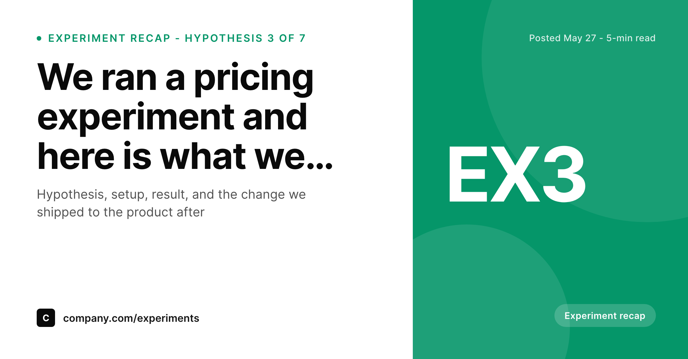
Experiment results need to be skimmable on the share image
Growth teams run experiments on a constant cadence and the best ones share the results publicly to build credibility with the product community. The challenge is that the most interesting part of the post, the result, is buried in the third paragraph by the time the post is structured properly. The share image rarely surfaces it, which means the unfurl on LinkedIn does not entice anyone to click through. SleekPixel solves this by putting the experiment number and the result lift directly into the card layout.
The setup uses three custom fields: experiment_number for the corner mark (EX3 or EX12), lift_pct for a percentage in the subhead, and confidence_pct for an optional second subhead line. The accent is a calm growth-team green or teal that signals analytics rather than marketing. The card is square at 1200 by 1200 for LinkedIn but reflows to landscape for Twitter without manual adjustment.
The post body carries the full analysis: the hypothesis, the experimental design, the segments, the result, and the follow-up change shipped to the product. The card carries the headline data. The two surfaces complement each other, which means a recruiter or a competitor scrolling the feed sees the headline lift before they click, and the click brings them to a thorough breakdown. Both audiences get what they want, which is rare for growth content.
Workflow
From experiment result to recap card
1. Add experiment custom fields
experiment_number, lift_pct, and confidence_pct as custom fields on the experiment recap post. The fields are short strings that the template reads into the corner mark, subhead, and second subhead line.
2. Pick the experiment recap template
3. Publish the recap post
4. Share to the growth audience
Output
Sample experiment recap card
A LinkedIn card with the experiment headline, the lift percentage in the subhead, the EX3 corner mark for the experiment number, and the company handle on the footer line.
Comparison
Default theme OG image vs SleekPixel for experiment recap cards
Default theme OG image
- Buries the result so the unfurl on LinkedIn entices nobody to click through
- Cannot show the lift percentage, which is the most interesting fact in the post
- Misses the experiment number, so multiple recaps look like the same generic post
- Treats experiments like marketing posts, which mismatches the analytics audience
- Forces a designer to lay out a one-off graphic for every experiment recap
SleekPixel
-
Maps
experiment_numbercustom field to the corner mark likeEX3 -
Renders the lift percentage from
lift_pctdirectly in the subhead - Shows the confidence interval on an optional second subhead line
- Uses a growth-team accent that signals analytics rather than marketing
- Composes deterministically on save with no headless browser involved
Features
What SleekPixel gives you for experiment recap card
Lift percentage in the subhead
The subhead pulls lift_pct directly so the card surfaces the headline result in the place readers expect. A growth analyst scrolling LinkedIn sees the percentage before they read the headline, which is the right priority for an experiment recap.
Confidence interval on a second line
The optional confidence_pct field renders a second subhead line like '95 percent confidence' so the recap looks rigorous rather than promotional. That single detail separates a serious growth team from one that posts lift numbers without statistical context.
Experiment number in the corner
The corner mark renders from experiment_number as EX3, EX12, or whatever short code your team uses. The series visualises the team's experimental cadence over time and gives each recap a stable identifier readers can reference.
Use cases
Where experiment recap cards earn the most engagement
LinkedIn growth shares
Growth and product leaders share experiment recaps on LinkedIn to build credibility with their network. The card surfaces the lift number directly, which gets more clicks than a generic banner with a buried result.
Internal company-wide Slack
Posting the recap URL in the company Slack channel surfaces the card with the headline result. Teammates see the impact at a glance before clicking through to the detailed analysis on the company blog.
Growth newsletter linkbacks
Growth newsletters frequently link to public experiment write-ups. The card carries the lift number into the newsletter preview, which makes the linkback feel substantive rather than promotional.
The bigger picture
Public experiment recaps build credibility one card at a time
Growth teams that share experiment results publicly earn a specific kind of trust. Practitioners read the recaps to learn how a serious team thinks about hypothesis design, statistical significance, and product follow-through. Recruiters use the recaps to evaluate the team's rigor.
Competitors track them to understand the company's experimental cadence. All three audiences want the same thing from the share image: the result, the number, and a sense of how serious the experiment was. SleekPixel makes those three elements the structural features of the card.
The lift percentage is the subhead. The confidence interval is the second subhead line. The experiment number is the corner mark.
Together they answer the practitioner's first three questions before the click. Once a team has shipped a few recaps with the same template, the corner mark becomes a recognizable signal. EX3, EX4, EX5 in a row tells the audience the team is running a serious program rather than a one-off campaign.
The cards line up in the LinkedIn feed as a chronological series, and the company develops a reputation for shipping recaps consistently. That reputation compounds in a way that single posts cannot. SleekPixel makes the series almost free to maintain because the post fields are the source of truth, which is exactly the architecture that growth teams want for content they will be producing for years.
Questions
Common questions about SleekPixel for experiment recap card
Three fields cover the standard case: experiment_number for the corner mark like EX3, lift_pct for the subhead percentage, and confidence_pct for the optional second subhead line. All three are short strings the template reads directly.
Yes. The field accepts any short string, so '+ 142 conversions per week' or 'doubled trial sign-ups' both render correctly. Most teams use percentages because they translate across team sizes, but absolute numbers work when the percentage is too small to feel meaningful.
Use the subhead to communicate the inconclusive result, like 'no significant lift, learnings below.' Negative results are some of the most valuable recap content, so the card should be willing to surface them honestly rather than spinning a non-result as a win.
No. The field is a free string, so use whatever convention your team prefers. Some teams use sequential numbers like EX1 through EX99, others use quarter codes like Q2-3, and others use experiment names like PRICING. The template renders whatever you supply.
Yes. The 1200 by 1200 canvas reads well on Twitter when shared as an image, and the layout reflows automatically if you switch to a 1200 by 675 ratio via the SleekPixel template configuration. The same rendered PNG works across both platforms without manual adjustment.
Treat the custom field as the source of truth for the post. If the lift number is revised after additional data, update the field and resave the post. SleekPixel rerenders the card with the new value so the share image stays consistent with the post body's narrative.
The preset is tuned for experiment recaps specifically, with hypothesis-and-result framing. For broader analytics or dashboard posts, the North Star metric preset or the company update preset usually fits better. All three templates share the same accent system for visual continuity.
Yes. The SleekPixel WP-CLI command can walk every post in the experiment recap category and rerender each card using the current template. Useful after a brand refresh or a template change, when you want the historical series to reflect the new visual language.
Pricing
More than 1000+
happy customers
Explore our flexible licensing options tailored to your needs. Upgrade your license anytime to access more features, or opt for a lifetime license for ongoing value, including lifetime updates and lifetime support. Our hassle-free upgrade process ensures that our platform can grow with you, starting from whichever plan you choose.
Lifetime ♾️
Most popular
EUR
once
- Unlimited websites
- Lifetime updates
- Lifetime support
...or get the Bundle Deal
and save €250 🎁
The Bundle (unlimited sites)
Pay once, own it forever
Elevate your WordPress site with our exclusive plugin bundle that includes all of our premium plugins in one package. Enjoy lifetime updates and lifetime support. Save significantly compared to buying plugins individually.
What’s included
-
SleekAI
-
SleekByte
-
SleekMotion
-
SleekPixel
-
SleekRank
-
SleekView
€749
Continue to checkoutBrowse more
- Spotify playlist cover
- Twitch panel images
- Poshmark listing images
- LinkedIn showcase page banners
- Apple Podcasts covers
- YouTube Shorts thumbnails
- Tidal cover art
- Snapchat snap images
- WhatsApp status images
- VK community cover photos
- X list banners
- Rumble thumbnails
- KakaoTalk channel banners
- Dailymotion thumbnails
- Warpcast frame images