






SleekPixel for A/B test result cards: experimentation shares
An A/B test recap belongs in the same league as a growth experiment recap, but it has its own conventions: winner letter, lift number, and traffic split. SleekPixel reads each of those from custom fields and composes a LinkedIn card that signals the result before anyone clicks through to the analysis.
♾️ Lifetime License available
A/B tests have their own conventions and the card should follow them
A/B test recaps follow a tighter convention than general growth experiments. The audience expects a winner letter (A or B), a lift number, a confidence interval, and a traffic split. Without those four facts, the recap reads as anecdotal rather than rigorous. The share image almost never includes any of them, which means the unfurl on LinkedIn does not differentiate a serious A/B test from a casual product post. SleekPixel handles the case with a preset specifically for A/B test recaps, with conventions tuned to that genre.
The setup uses four custom fields: winning_variant for the corner mark (A or B), lift_pct for the subhead percentage, confidence_pct for the second subhead line, and traffic_split for an optional footer note like '50/50 across 8.2k users.' The accent is a teal that distinguishes A/B tests from broader experiment recaps. The card is square at 1200 by 1200 for LinkedIn.
The post body carries the standard A/B recap structure: setup, screenshots of the variants, statistical analysis, and the rollout decision. The card carries the four headline facts. Together they make the recap legible to both practitioners (who want the rigor) and a broader audience (who want to skim the result). That dual readability is what separates a recap that builds credibility from one that gets scrolled past.
Workflow
From A/B result to recap card
1. Add A/B test custom fields
winning_variant, lift_pct, confidence_pct, and traffic_split as custom fields on the A/B test recap post. The fields capture the four standard A/B conventions that the template reads into the layout.
2. Pick the A/B test template
3. Publish the recap post
4. Share to the practitioner audience
Output
Sample A/B test result card
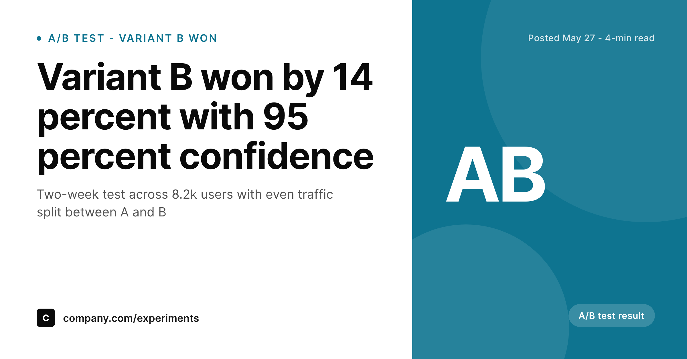
A LinkedIn card with the winning headline, the lift percentage and confidence in the subhead, the AB corner mark, and the traffic split detail on the footer.
Comparison
Default theme OG image vs SleekPixel for A/B test result cards
Default theme OG image
- Does not surface the winning variant, so the recap reads as inconclusive at a glance
- Cannot show the lift percentage, which is the headline number practitioners look for
- Misses the confidence interval, which is the rigor signal that separates serious recaps
- Treats A/B tests as routine posts so the convention-driven audience does not engage
- Forces a designer to lay out a one-off graphic for every test recap
SleekPixel
-
Maps
winning_variantcustom field to the corner mark asAorB -
Renders
lift_pctdirectly in the subhead as a formatted percentage -
Shows
confidence_pcton an optional second subhead line -
Surfaces the traffic split from
traffic_splitin the footer for context - Composes deterministically on save with no headless browser involved
Features
What SleekPixel gives you for A/B test result card
Winning variant in the corner
The corner mark renders the winning variant letter from winning_variant as A or B. That single letter answers the practitioner's first question instantly, before the headline is read, which is the right priority for an A/B test recap.
Lift and confidence in the subhead
The subhead carries the lift percentage and the confidence interval from lift_pct and confidence_pct. Together they communicate both the magnitude and the rigor of the result, which is what an A/B test recap is supposed to demonstrate to its audience.
Traffic split in the footer
The footer renders the traffic split detail from traffic_split as 'an even split across 8.2k users' or similar. That single line establishes the scale of the test, which determines how seriously the audience should take the result.
Use cases
Where A/B test recap cards earn the most engagement
LinkedIn practitioner posts
Growth and product leaders share A/B test recaps on LinkedIn to build credibility with the experimentation community. The card surfaces the winner, the lift, and the confidence directly, which is what the practitioner audience wants to see.
Growth newsletter linkbacks
Growth newsletters frequently link to public A/B test write-ups. The card carries the headline numbers into the newsletter preview, which makes the linkback feel substantive rather than promotional.
Internal experimentation reviews
Posting the recap URL in the company experimentation Slack surfaces the card with the result data. Teammates can scan the result without reading the full body, which speeds up internal reviews and decisions.
The bigger picture
A/B test recaps build credibility one convention at a time
A/B testing has tight conventions because the audience expects rigor. A recap that does not surface the winner letter, the lift percentage, the confidence interval, and the traffic split reads as anecdotal rather than serious. The default share image is the worst possible surface for those conventions because it surfaces none of them.
A practitioner scrolling the LinkedIn feed has no way to distinguish a careful test recap from a marketing post until they click through, which means most A/B recaps lose the engagement they deserve. SleekPixel solves this by encoding the four conventions directly into the card layout. The winner letter becomes the corner mark.
The lift and confidence become the subhead. The traffic split becomes the footer. The headline carries the post title, the accent signals analytics rather than marketing, and the result is a card that reads as a serious recap before anyone clicks.
The credibility benefit compounds when the team ships multiple A/B test recaps over time. Each card uses the same template, the same accent, and the same convention. The practitioner audience learns to recognise the format and engages with it before they engage with most other content from the company.
That recognition is the actual goal of public A/B test sharing, and SleekPixel makes the format consistent enough to be recognised across dozens of posts without requiring a designer in the loop for any of them. The investment is one template, and the return is a multi-year stream of recaps that look like they belong together because they do.
Questions
Common questions about SleekPixel for A/B test result card
Four fields cover the standard A/B convention: winning_variant for the corner mark, lift_pct for the subhead, confidence_pct for the second subhead line, and traffic_split for the footer. Together they communicate the result, the rigor, and the scale of the test.
Use the winning_variant field to render 'No winner' or 'Inconclusive' as the corner mark and the subhead to communicate the lack of significance. Negative results are some of the most valuable A/B recaps to share publicly, so the template should communicate them as honestly as positive results.
Yes. The winning_variant field is a free string, so 'C' or 'D' work for multivariate tests. The corner mark renders whichever letter or name you supply, and the subhead carries the lift relative to the control. For tests with more than four variants, consider switching to the experiment recap preset which handles complex setups better.
No. The traffic_split field is a free string, so '70/30 split' or '20/80 split' both render correctly. Most teams run even splits but some tests intentionally weight traffic toward one variant, and the field accommodates either case without template changes.
The subhead carries the primary metric, which is usually the lift on the main conversion goal. Secondary metrics belong in the post body, where they can be discussed with appropriate context. The card is intentionally focused on the one number that determines the rollout decision.
Yes. The card surfaces whatever lift and confidence you put in the fields, regardless of the statistical method behind them. A sequential test recap that uses a sequential p-value or a Bayesian posterior renders the same way; only the analysis approach in the post body differs.
Yes. The SleekPixel WP-CLI command can walk every post in the A/B test category and rerender each card using the current template. Useful after a brand refresh or a switch to a new accent system, when you want the historical series to reflect the current visual identity.
In the WordPress media library, attached to the post as the featured image. The same file powers the OG image, the Twitter image, and the RSS thumbnail, so every consumer of the post URL sees the same card without duplicate uploads cluttering the library.
Pricing
More than 1000+
happy customers
Explore our flexible licensing options tailored to your needs. Upgrade your license anytime to access more features, or opt for a lifetime license for ongoing value, including lifetime updates and lifetime support. Our hassle-free upgrade process ensures that our platform can grow with you, starting from whichever plan you choose.
Lifetime ♾️
Most popular
EUR
once
- Unlimited websites
- Lifetime updates
- Lifetime support
...or get the Bundle Deal
and save €250 🎁
The Bundle (unlimited sites)
Pay once, own it forever
Elevate your WordPress site with our exclusive plugin bundle that includes all of our premium plugins in one package. Enjoy lifetime updates and lifetime support. Save significantly compared to buying plugins individually.
What’s included
-
SleekAI
-
SleekByte
-
SleekMotion
-
SleekPixel
-
SleekRank
-
SleekView
€749
Continue to checkoutBrowse more
- Dribbble shot covers
- Bluesky feed banner
- Farcaster cast images
- YouTube banner art
- Threads social images
- kbin post images
- YouTube playlist covers
- eBay listing images
- LinkedIn ad images
- Xiaohongshu cover images
- LinkedIn showcase page banners
- Mastodon post images
- Kick stream thumbnails
- Threads post images
- Facebook ad images